Design system and key flows for a real-estate tokenization investment app.
Senior product design and design-system work for Reental's investment platform — plus leading the brand rebrand. Financial flows, tiered membership, and property-level transparency, all in one connected system.
The problem
Reental lets people invest in tokenized real estate in fractional amounts — buying a share of a property's rental income and appreciation instead of a whole building. That means the product has to do two things well at once: make a genuinely complex financial instrument feel as simple as a consumer banking app, and build enough trust that people commit real money to it.
My scope covered senior product design and design-system work across the platform — reusable UI patterns for financial flows and account states — plus leading the brand rebrand.
The system, in six moves
One number, then the ones that explain it
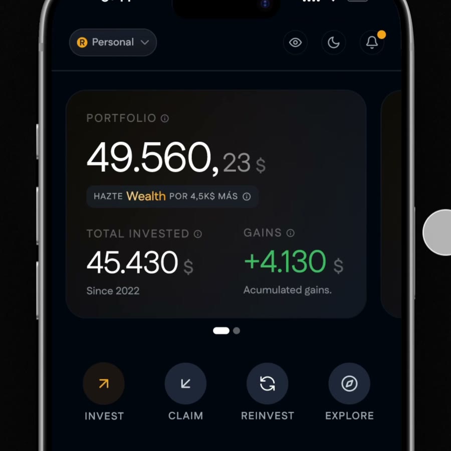
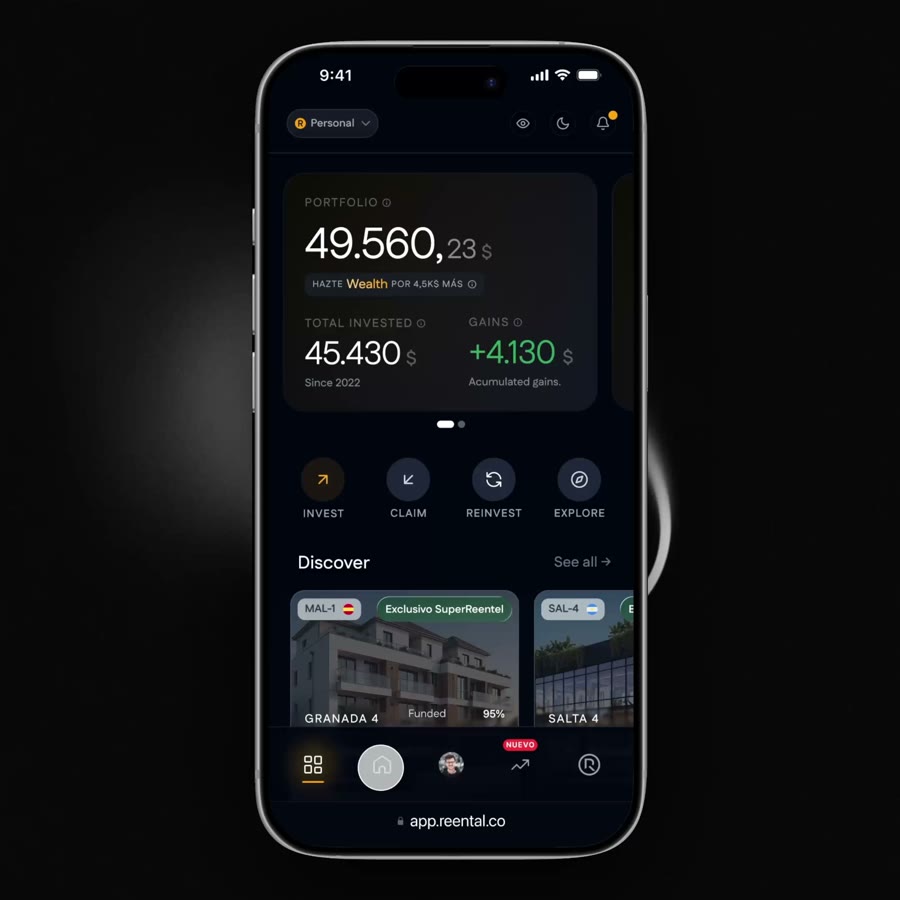
Total portfolio value leads, with invested amount and accumulated gains right underneath — so the dashboard answers "how am I doing?" before anything else. Invest, Claim, Reinvest, and Explore sit as one consistent action row underneath, so the next step is never a hunt.
Property cards that lead with the number that matters
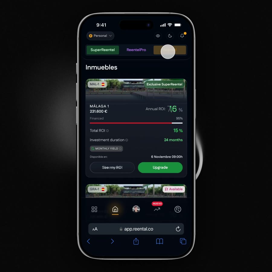
Each card surfaces funding progress and annualized return up front — the two numbers an investor actually decides on — with the property photo doing trust-building work rather than carrying the data. A referral module (earn per invite, no cap) sits right in the scroll, not buried in a settings menu.
Three membership tiers, one comparison view
Reentel, ReentelPro, and SuperReentel carry different ROI bands — designing this meant making an upgrade path legible without turning the dashboard into a pricing table. Tabs switch context per property, so the same design pattern works whether you're comparing tiers globally or on a single listing.
An earnings simulator instead of a wall of disclaimers
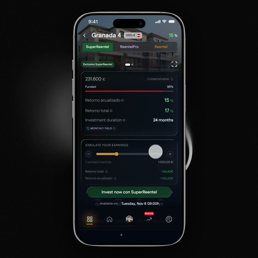
Funding progress, annualized and total return, and investment duration are laid out as plain facts — then a slider lets you simulate your own return at a chosen investment amount before you commit. Financial transparency (dossier PDF, project timeline, funding source) lives one scroll away, not gated behind support.
A built-in crypto wallet that reads like a bank account, not a block explorer
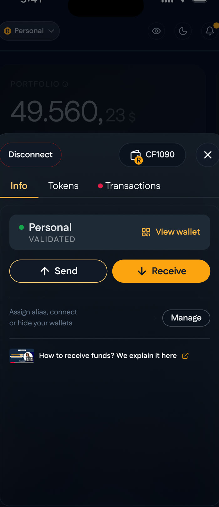
Since property shares are tokenized, every investor needs a wallet — so it's native to the app rather than an external integration. Info, Tokens, and Transactions sit as tabs on the same sheet, with Send and Receive as the two primary actions. Assigning an alias and managing multiple wallets stays one tap away, so the crypto layer never has to look like crypto.
QR-first, with the network named up front
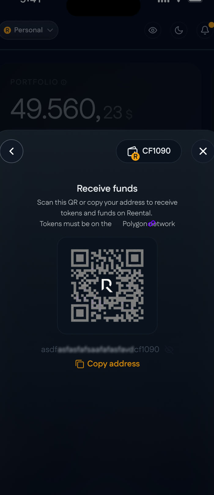
Receiving funds leads with a scannable QR and a copyable address, and states the required network (Polygon) plainly instead of assuming the investor already knows their chain from their token standard. One wrong network is an unrecoverable transfer — so this screen's whole job is preventing that mistake before it happens.
Design system, built with MCP in the loop
The screens above sit on top of a proper token-based design system, not a one-off Figma file — built and kept in sync with an MCP-driven workflow between Figma and code, the same Figma DS → MCP → Storybook pipeline used across my other AI-assisted work.
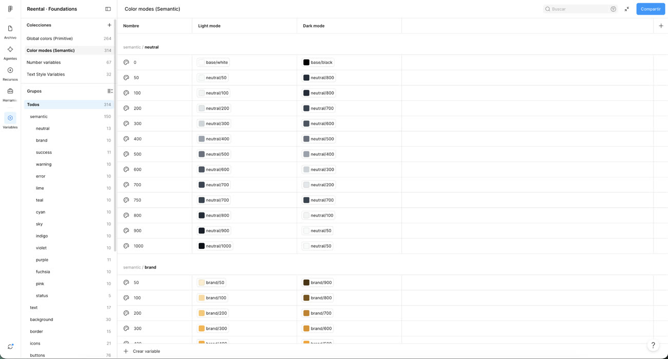
314 semantic color variables, light and dark mode mapped 1:1
Every neutral, brand, and status color is a semantic token bound to a primitive — not a hardcoded hex — so switching mode is a variable swap, not a redesign.
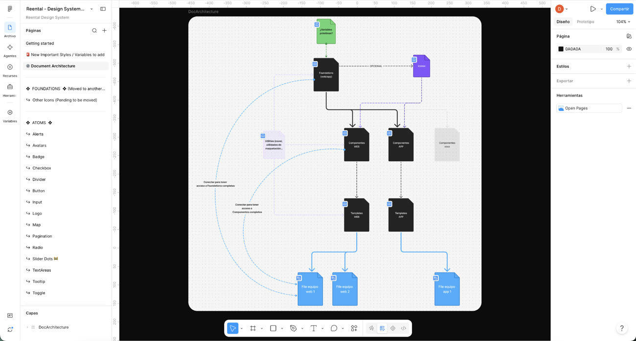
Foundations → Components → Templates, mapped explicitly
The system's own dependency graph is documented as a diagram, not tribal knowledge — Foundations feed Components (split web/app), which feed Templates, which feed the actual product files. New contributors (human or agent) can trace exactly what depends on what.
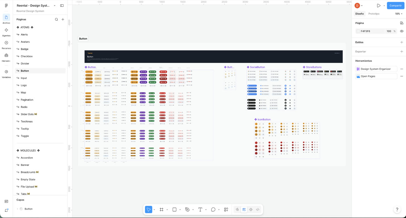
Every button variant, once, not once-per-screen
Primary/secondary/ghost states across sizes and colors, plus purpose-built variants (social login, app-store badges, icon-only) — the atomic layer that every screen in the earlier sections is actually built from.
Craft details
Financial flows and account states were built as reusable patterns — the same card, tab, and detail-sheet components recombine across Discover, property detail, and the tiers comparison instead of each screen reinventing its own layout.
High-contrast numerals, a restrained accent palette (gold for primary actions, green for gains, red for funding urgency), and generous spacing — built for a dark UI to read cleanly under real lighting conditions, not just look good in a mockup.
Led the rebrand alongside the product work, so the visual identity and the app's UI language shipped as one coherent system rather than a brand refresh bolted onto an existing product.
Every property carries its funding %, ROI, duration, and a downloadable dossier PDF — the design leans on real disclosure rather than persuasive copy to build the trust a financial product needs.
Want the full walkthrough?
Happy to walk through the design system and the flows in more depth.
Ask for a walkthrough →