Redesigning the ticket kiosks and booking flows for one of Europe's largest resorts.
In a 4-person product design team, via Randstad Digital — self-service kiosks, the in-app Park Ticket funnel, and Hotel Reservations.
The problem
PortAventura World runs park tickets, hotel reservations, and physical self-service kiosks as three connected surfaces — but they'd grown independently. Guests hit friction switching between booking online and completing a purchase at a kiosk on-site, and the legacy kiosk UI wasn't pulling its weight against the app.
One of the core challenges was a disparity of frontend UI terminals — mainly across the kiosks — running on an old legacy ticket system that had never been reconciled with "Express Ticket," the selling system designed a year earlier for the Android/iOS apps. Express Ticket had already proven itself and become the de facto standard once Randstad Digital joined the project — the job was unifying the kiosk fleet around that same proven system instead of maintaining two parallel ticket logics.
My scope covered all three: the Park Ticket purchase funnel, the Hotel Reservations flow, and a full redesign of the self-service kiosk hardware UI — plus the motion and accessibility work needed to ship it at the resort's scale.
The flow — kiosk to confirmation
-
Language & entry
The kiosk opens on a language selector — Spanish, Catalan, French, English — over live park footage rather than a static screen, so it reads as part of the resort, not a generic terminal.
Real capture below -
Pass & ticket selection
Guests choose the pass type (single park, combined, Express) and date. This step carries the most decision weight, so it was designed to surface the highest-intent options first based on time-of-day and queue data.
-
Add-ons & upsell
Optional add-ons (fast-track access, parking, meal plans) are presented without blocking the core purchase path — a deliberate trade-off between revenue opportunity and keeping the kiosk queue moving.
-
Payment
Card-present payment flow, tuned for the kiosk's touch hardware and outdoor lighting conditions — larger touch targets, higher contrast than the in-app equivalent.
-
Confirmation & handoff
Ticket issuance with a clear next step (print, QR to phone, or both), closing the loop from kiosk back into the guest's day at the park.
Raw screen recording, unedited — Multipases Express selection through purchase confirmation.
Desktop booking
The same ticket logic ported to desktop — multi-day, multi-park passes with a live selection summary and running total, for guests booking ahead rather than at the kiosk.
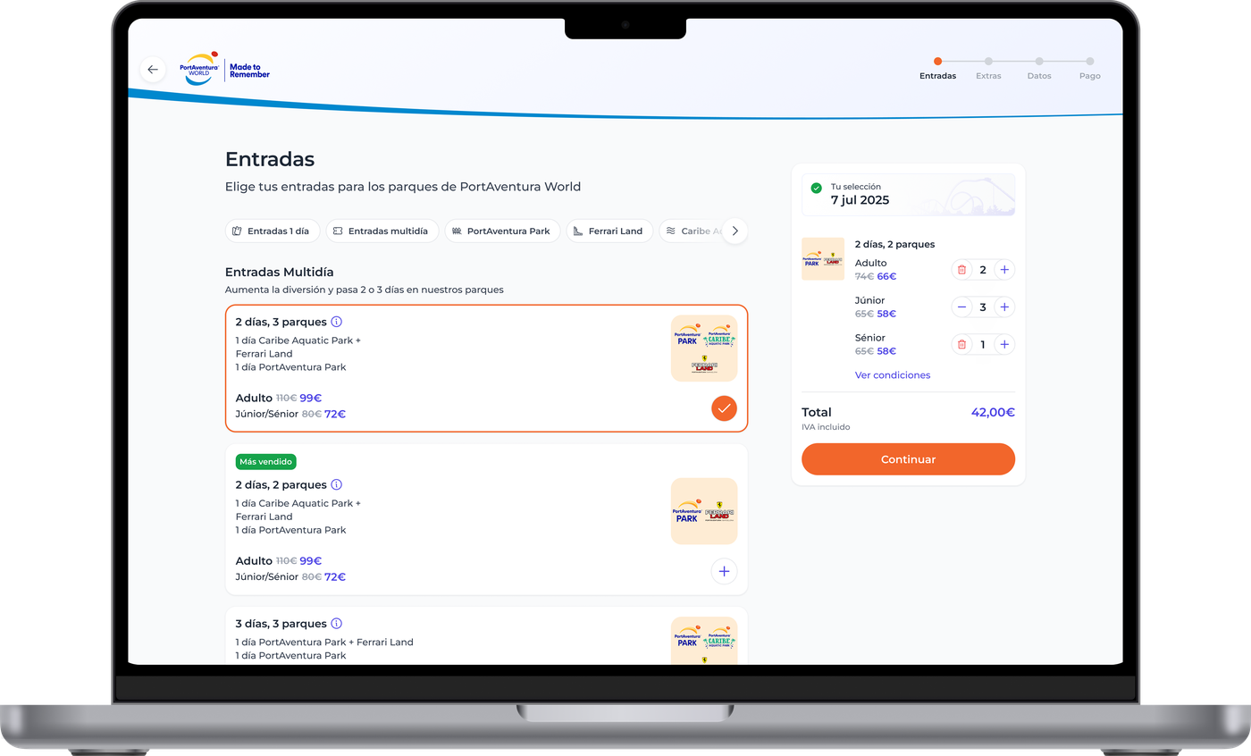
Real capture — Entradas step, multi-day/multi-park selection with live cart summary.
Multi-brand design tokens
PortAventura World runs four main brands under one roof — PortAventura Park, Ferrari Land, Caribe Aquatic Park, and, last but not least, PONIENT Hotels — and the dev environment had a genuinely painful problem: typography and color tokens named after their aesthetic ("medium", "bold") instead of their role. That works for one brand. The moment a second brand needs "bold" to mean something visually different, the token itself becomes a lie.
The fix was a unified style-token system managed through the Tokens Studio Figma plugin, connected directly to our repo — semantic naming (base / variant / interactive) instead of aesthetic naming, so the same token resolves to a different value per brand without changing what it's called. MCP sits in that pipeline too: it flags naming or value inconsistencies at the pull-request stage, before a token JSON change ever reaches main.
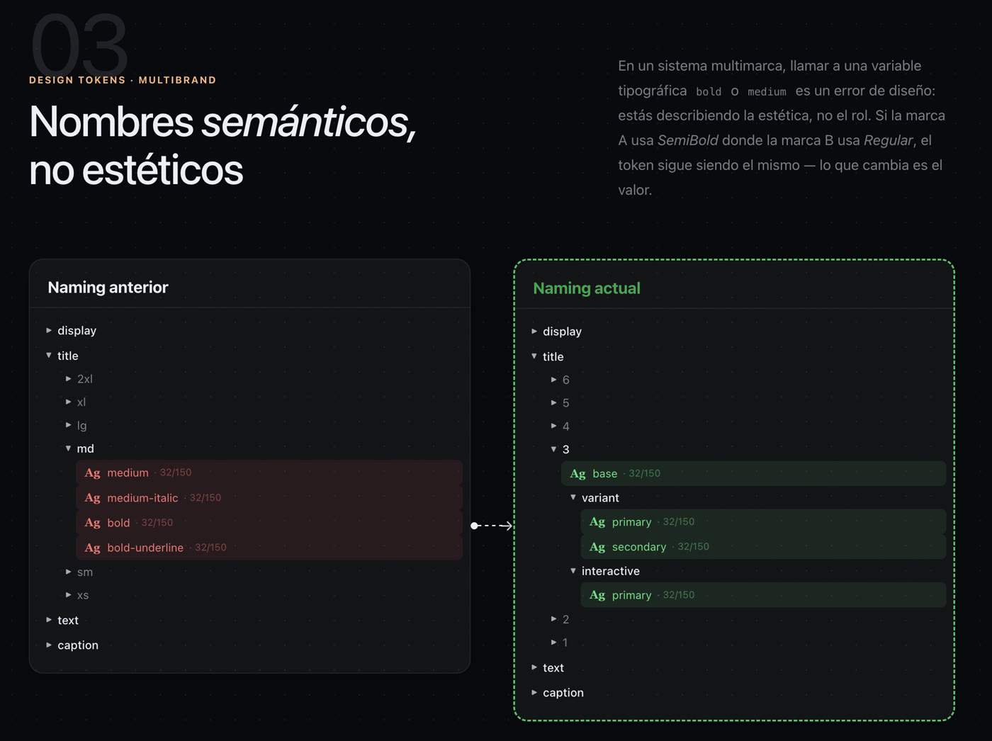
Real slide from the token system documentation — old aesthetic naming vs. the current semantic naming.
Craft details
Produced Lottie JSON animations for production handoff, so motion detail survived the trip from design file to shipped kiosk without engineering having to hand-code transitions.
Touch targets, contrast, and timing were tuned specifically for outdoor kiosk conditions — different constraints than the in-app equivalent, and not something a generic component library solves out of the box.
Every screen was designed against real queue-time pressure — the kiosk needed to move guests through fast without cutting corners on the upsell or the ticket-selection decision.
Figma design system components synced through to Storybook branch previews, so engineering could review live components in PR context — fewer handoff gaps, faster builds.
The story, from the team
Randstad Digital's own recap of the project — the CTO and Tech Lead on what actually changed under the hood, told better than I can from the design side alone.
Want the full walkthrough?
Specific revenue figures stay off this page for confidentiality — happy to walk through them directly.
Ask for a walkthrough →