A digital passport for your bicycle — hardware, app, and brand from zero.
Founding Designer for a connected hardware product: a digital bike passport, IoT GPS tag, and mobile app, plus the brand identity that ties them together.
The problem
A stolen or resold bike has no story it can prove. Ownership is a receipt in a drawer, maintenance history lives in someone's memory, and a buyer has no way to verify either. Bikiot's answer is a digital passport tied to the bike itself — backed by a physical IoT tag, not just an app record that anyone could fake.
As founding designer, my scope covered the full 0-to-1: product design and brand identity for the passport, the IoT hardware form factor, and the consumer app flows around them.
Design direction: where the mark came from
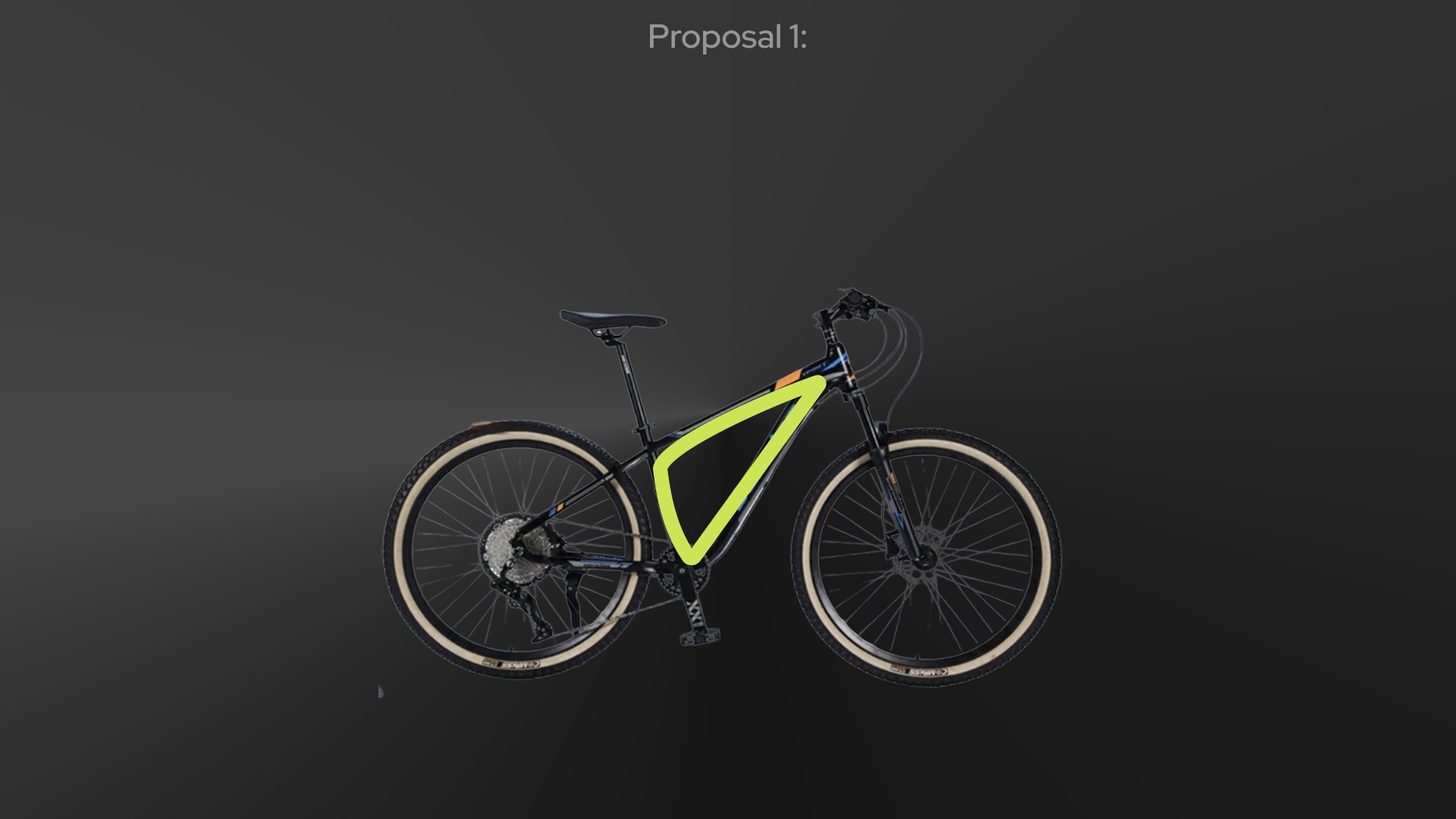
The logo is the bike's own frame
Rather than design an arbitrary icon, I traced the mark directly from the bicycle's own chassis — the down tube and head tube angle of a real frame, isolated and simplified. The wordmark's brief: dynamic, professional, a little fun, built on Red Hat Display's avant-garde weight.
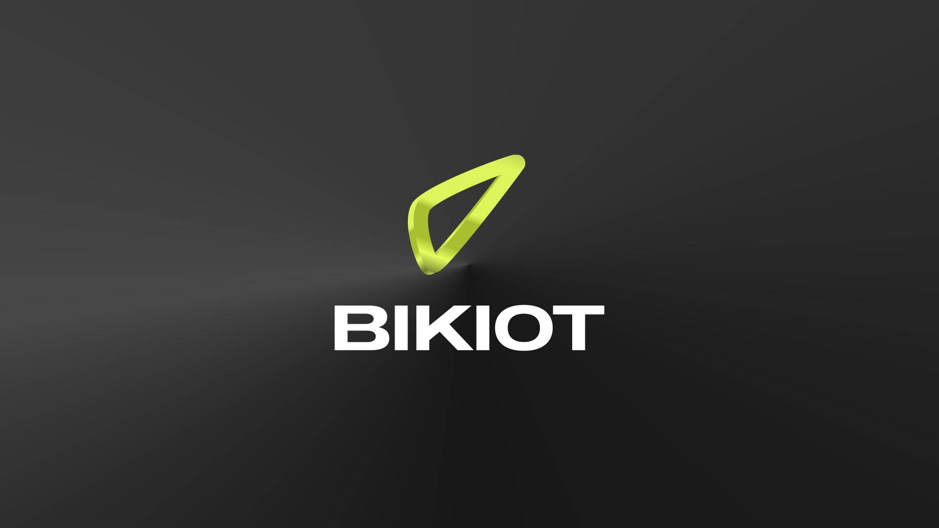
One mark, adaptable across contexts
The resulting mark reads on light, dark, and the brand's own volt-green background alike — a requirement for a product that lives across an app, IoT hardware, and physical passport cards. Delivered as a full brand direction deck (in collaboration with Productea) before any product screen was drawn.
The system, in four moves
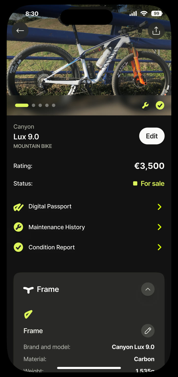
One screen, three trust signals deep
The bike's own photo leads, with Digital Passport, Maintenance History, and Condition Report as three tappable entries underneath — the exact record a buyer would want to check before paying €3,500 for someone else's bike. Frame spec (brand, material, weight) lives one scroll away for the fully technical version.
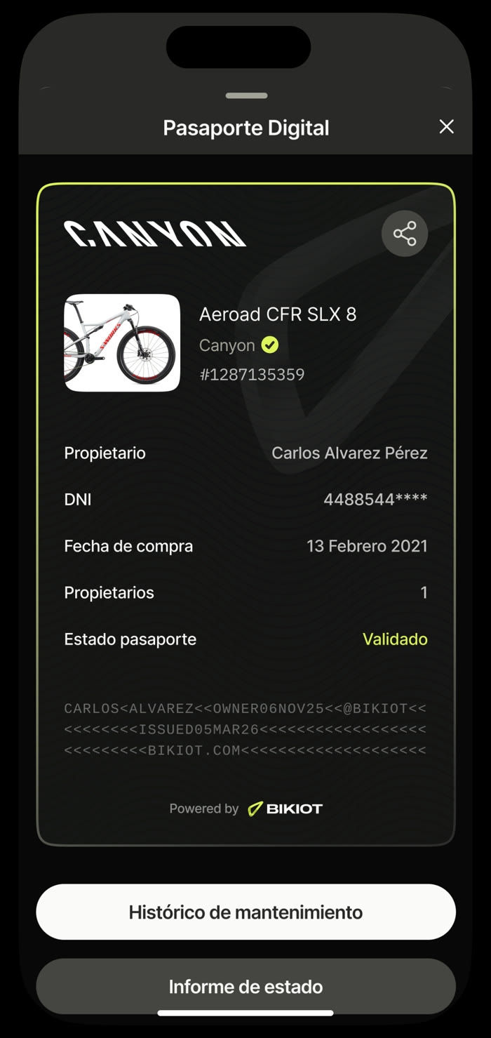
Designed to read like an actual passport, on purpose
Owner, ID number, purchase date, and validation status — laid out with the same visual authority as a government document, down to an MRZ-style code block at the bottom. That borrowed familiarity is doing real work: it signals "this is a verifiable record," not just an app screen.
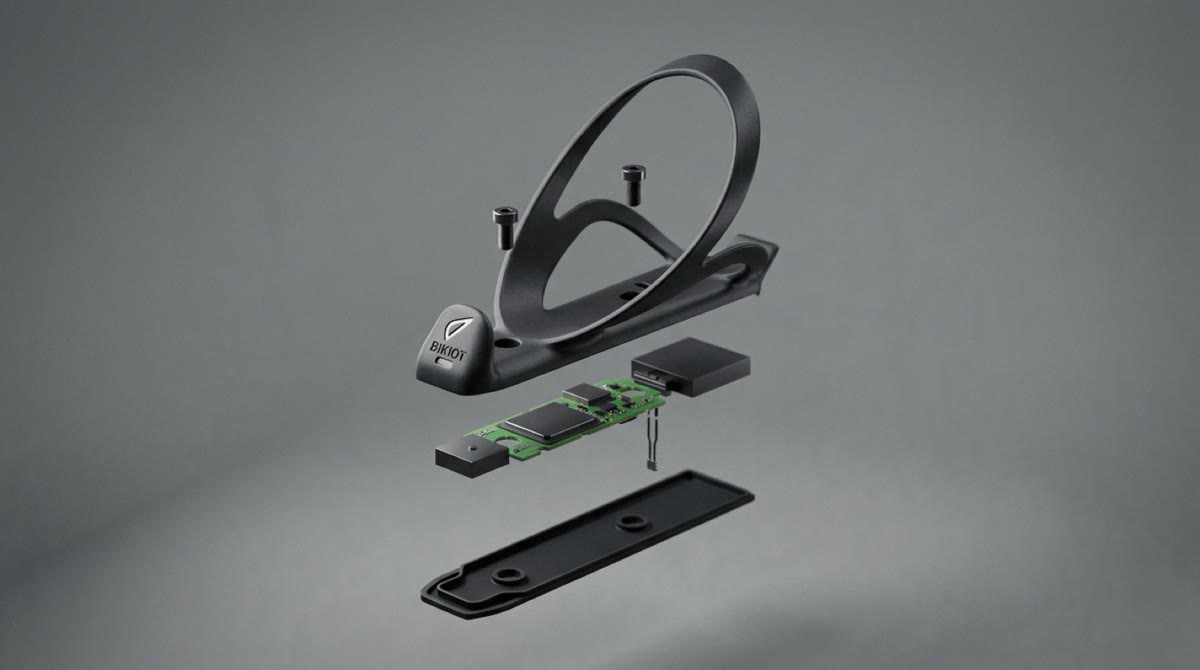
The passport is only trustworthy because of what's bolted to the frame
The GPS tag mounts where a bottle cage would go — a form factor most bikes already have room for, so it needed no custom mounting hardware. Designing the physical product meant working with the actual PCB, battery, and enclosure constraints, not just the screens around them.
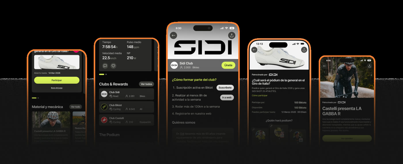
Community and rewards, without turning the app into a social network
Ride stats (time, average speed, power) sit next to Clubs & Rewards — brand-run challenges (Sidi, Castelli) that give riders a reason to open the app beyond checking their bike's status. It's a loyalty layer built on top of the passport, not a separate product.
Craft details
As founding designer, the brand identity — name, mark, typography, the whole visual language — shipped alongside the product rather than being retrofitted onto it later.
Designing a physical IoT product means the UI has to account for real constraints — battery life, mount compatibility, tamper resistance — not just what looks good in Figma.
The passport's design deliberately echoes real government ID documents (MRZ code, validation badge) to make an unfamiliar concept — a bike's digital identity — feel immediately legible.
Consumer app, hardware form factor, and brand identity as one coherent system — the kind of scope a founding design hire owns, not a single-surface project.
Want the full walkthrough?
Happy to walk through the product, hardware, and brand work in more depth.
Ask for a walkthrough →